
The magical powers of the internet have once again landed a curious soul on your website. What happens during the following seconds and minutes determines whether the person will convert or not.

In this article, I’ll run you through five common mistakes that can be deadly to your website’s conversion rate:
- Mismatch between expectations and reality
- Confusing, bad design
- Poor website performance
- No customer support or help available
- The form needs work
Plus, I’ll share how you can avoid each of these to increase your conversion rate and deliver a great online experience by avoiding the hazards.
Let’s jump to it.
Why should you think about your conversion rate?
Your website conversion rate has obvious links to revenue and profit. More conversions mean more business and better returns for your marketing investment.
When you fail to convert, it means that somewhere in the buyer’s journey, the potential buyer decided that you can’t deliver what they need, or that they’re better off with someone else.
Website conversions are best thought of as a reward. Visitors reward you for being helpful, showing that you care, and for making it easy for them to achieve their goals. That’s right, nobody really cares about what you’re selling.

A lot needs to happen before a conversion, and each step on the way can quickly become a hurdle. And you know what? Buyers dislike hurdles. We all know this, but it’s amazing how difficult obstacles we place between customer and conversion.
Before we move on to the five mistakes that can ruin conversion rate, think about outbound sales for a moment. You know, cold calling, emailing, and such. The job (your job) is to make buying extremely easy.
Why would it then be acceptable to make converting on your website difficult? Well, there is no reason. The best way to increase conversion rate is to make converting easy.
Now, avoid these five common conversion pitfalls, and easy it shall be.
The five mistakes that kill your conversion rate
There are lots of things that can impact your conversion rate, but you can’t control all of them. Here are five common mistakes that you have the power to avoid—as long as you make some changes now.
1. Mismatch between expectations and reality
The first conversion pitfall goes beyond the website. I need to address it, because if you fall already here, you can be the best conversion wiz on the planet and still fail to increase your conversion rate. I’m talking about a basic marketing and communications principle: continuity.
People land on your site from a variety of sources, and they all do it for a reason. Perhaps they saw a social post, clicked on your ad, or searched for something and found you on Google. Whatever the case, they are expecting to find more information or complete an action they read or thought about.

Your tone on social can be different, but your brand should still be recognizable.
Therefore, the first step in improving conversions is to match your ads, SEO titles, and so on, with the content on your landing pages. Obvious symptoms of a mismatch are a high bounce rate coupled with short average time on page. There’s only one first impression, so you’d better make it count.
Fortunately, this first pitfall is not very difficult to avoid. You just need to stay true to yourself and your value proposition, pay attention to targeting, and steer clear from ridiculous clickbait. Common sense goes a long way. Great, let’s move on to the next one!
2. Confusing, bad design
Ok, I’m on the site. Now what?
So much can go wrong in those first seconds when someone lands on your website. One of your worst conversion enemies is confusion.
Because of our impatience with websites, first impressions make all the difference. I don’t have exact data on this, but big G tells me that a common average for pages per session is around two. In other words, users won’t stay guessing where to click for long before leaving your website.
A sad but true example: an ecommerce product page, where it’s impossible to add the product to the shopping cart. Think about landing here from an ad! More commonly, firms make it difficult to find contact information and get in touch. Talk about real conversion killers.
I simply can’t refrain myself from linking this classic example of what bad UI design does to a person. It’s a harsh one, but illustrates very well what your site visitors will experience when they aren’t sure what to do next.

It’s easy to fall into the trap of thinking that more is better. In reality, adding more stuff on the site makes things more complicated. Complicated doesn’t mix well with conversion.
An effective way to remove confusion is to simplify. Reduce the number of CTAs, design elements, and other distractions. Direct all focus on the step that will take the user towards conversion. Remember, we’re trying to make converting easier.
3. Poor website performance
How long would you wait for a page to load? What if you find a broken link on the website you’re planning to make a purchase on—is once enough to make you terminate the tab?
Not only does a slow or buggy site make users bounce, it also eats away the site’s search rankings. So, after some time, it becomes even harder to get people on the site in the first place. Who are you going to convert then?
Every second counts. Around 50% of consumers expect a web page to load in two seconds or less. According to Google, the probability of bounce increases by 90% as page load time extends from 1 to 5 seconds. Even mobile users are now demanding desktop-level browsing experiences, so site performance really is a thing to take seriously.
Speed and stability have an even more fundamental link to conversions: trust. In the case of poor website performance, users quickly put two and two together. “Ok, this vendor clearly can’t deliver a smooth UX, so how can I trust them to deliver on their product and service promise?”
Yikes. You don’t want your potential customers pondering over this.
The internet is full of tools and resources for checking and improving your site performance. Start your journey by analyzing your current site performance for desktop and mobile. Tools like this Google Page Speed Insights give you direct suggestions on how to improve page load times.
4. No customer support or help available
We’ve established that several technical and design aspects can ruin your conversion rate, but there’s also a more human side to conversions. Or a lack of it, to be exact.
The website is just one, albeit central, touchpoint along the buyer’s journey, or funnel, if you will. In each phase of the journey, customers have a set of specific questions and needs on their mind. You guessed it—it’s your job to provide the answers and support they need.
And what if you don’t?
They leave, and you can say goodbye to another lost conversion opportunity.
Make it apparent that you’re available if a customer needs your help. Great content is the backbone of good service, because what you say on your pages should address the things going through the visitor’s mind. But obviously, you can’t write absolutely everything on the website.
For the visitors who want help with more specific needs, or just didn’t take the time to read through your content (that’s more people than you think), always provide an easy way to contact you.
When I say easy, I really mean quick and effortless. If it takes several clicks, messages, calls and hours to get a response, most people will turn to someone else. With that in mind, a good and responsive support function usually combines automation and live human service.
Live chat is great if you can tie resources to it. Chatbots are perfect for instant support around the clock. More static methods like answers to FAQ and other helpful resources are a minimum requirement, and you want to make sure these aren’t hidden too deep on your site.
Website support is best served context-specific, personalized, and immediate. The impact on conversions is twofold. Timely and accurate service helps retain visitors, and each positive service encounter also nudges them towards conversion.
5. The form needs work
You’ve got your content, design, website performance, and customer support sorted—awesome! Someone is just about to convert on your site. And then...
This is the moment of truth.
The point of conversion ultimately determines whether you will reap the rewards or watch all your hard work go up in smoke. Remember when I said converting should be effortless? This is the final test to see if it is.
So often things are going just fine, and then at the finish line, the potential customer drops off because there’s a hurdle too high or a hoop too tight to get past. In most cases, this issue is related to, wait for it … contact forms.
I’m sure you’ve had your fair share of suboptimal experiences with forms. These are the two most common reasons why contact forms fail to capture the conversion (and here’s a more detailed take on how to improve forms):
1. The form is looooong
Long forms overwhelm users. You know the case: one glance at the required fields makes you feel like you’re an elephant about to do a decathlon while juggling seven crocodiles with your trunk. If the initial despair isn’t enough to make you quit, each empty field or selection will make you think once again if all that work is worth it. If you’re gonna use forms, stick to a three-field maximum.
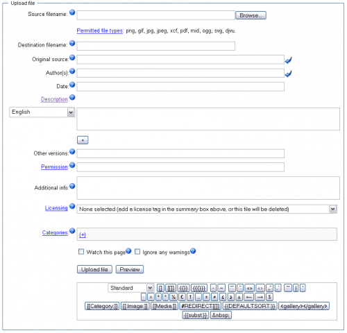
There’s so much wrong with this form that it hurts the brain. The length of it is the most obvious problem—I lost count at 11 fields. Not to mention the open fields and other cryptic hoops to jump through.
2. The form is ambiguous
Besides sheer length, forms often include questions we (the customers) don’t know the answers to. For firms, it’s a classic case of failing to be customer centric. What makes this even worse is that the questions come with open text fields. “Description,” “Additional information,” and so on. How are you as the customer supposed to know what to write? Leaving the site can become really tempting, really quickly.
It’s not that all forms are bad. But many times the conversion threshold is so high, that convenience-seeking people will prefer to see if another vendor makes converting easier.
Besides making your forms more snappy and intuitive to fill in, there’s another way to lower the threshold and improve conversion rate. I already mentioned chatbots with customer support, but the technology is even more effective for increasing conversions.
Chatbot conversations remove several conversion hurdles and friction. They’re easy, fast, relevant, personal, and they engage users bit by bit. There’s already a bunch of reasons why you may want to try chatbots as conversion tools. If you’re more into numbers, I’ll just leave this here: chatbots increase website conversion rate on average by 10-100%.
Conversions are earned—so is a high conversion rate
There are many ways to inadvertently kill a conversion. My goal here was to describe some of the most common conversion pitfalls so that you can avoid them and save your conversion rate.
Relevance, speed, simplicity, trust, helpful content, intuitive design, and the list goes on. All of the basic marketing, sales and design principles determine your conversion success. Ultimately, conversions are a sign of trust and a positive experience.
Before you finish reading and get to work on improving your conversion rate, I’m challenging you to switch your mindset: You don’t just get conversions; you need to earn them. No go put the work in, avoid these mistakes, and watch your conversion rate soar.
About the author
Otto Antikainen is a brand and content marketing champ always looking to make customer experiences a little bit better. He works as Marketing Specialist at Leadoo Marketing Technologies, the team behind conversion platform Leadoo. Connect with Otto on LinkedIn.