
A few weeks ago, I ran a workshop on startup landing pages with some founders working on growing their businesses. The landing pages were great—lots of good information, visual appeal, and more—but there was room for improvement on each of them.
We talked through tips for creating concise, appealing, and effective landing pages that can work as a lead-generation tool. These tips aren’t just applicable to the founders I talked with. Everyone can benefit from them.
So today, I’m sharing those tips with you.
Why are startup landing pages important?
Landing pages are important tools for lead generation for any business. For startups, these pages could be the first impression of your company and your brand, which makes it even more important to get them right.

You need to explain your offer and your business to the viewer without overwhelming them with either too much information about your company or too many form fields. And this isn’t just about a first impression—it’s about your business metrics, too. A HubSpot study of 40,000 landing pages found that conversion rates decrease as forms get longer.
That’s why today I’m sharing tips for making your startup landing pages informative and effective.
How to make your startup landing pages more effective
Now, here are ten tips that I shared with startup founders about how to adjust their landing pages for better messaging, better design, and better results.
1. Appeal to emotion in your copy
This list isn’t in any order—these are all important tips, but this one might just deserve top billing. Your landing page copy should be concise and persuasive, and emotional appeal works well for quick, compelling copy.
To write copy that appeals to your viewer’s emotions, focus on how your customers feel when they need your product or how they’ll feel once they purchase your offering. This appeal to emotion is effective, too. A 2016 Nielson study found that ads that encouraged the most significant emotional responses led to more sales.
Here’s an example startup landing page from Allpass.
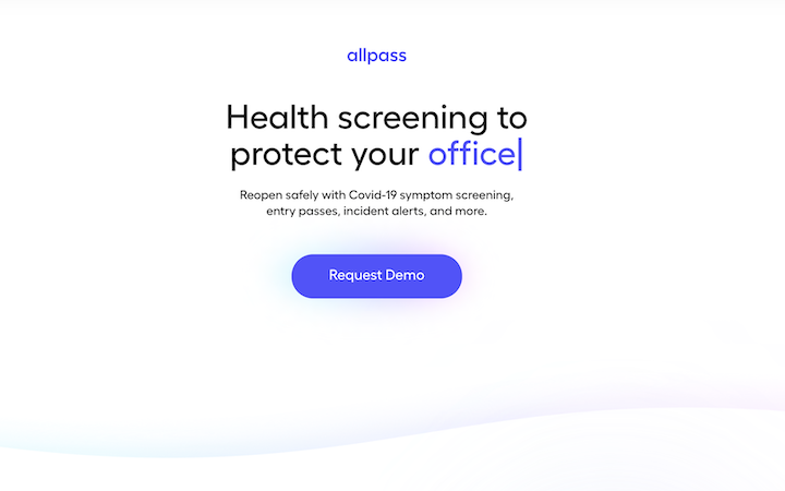
This page uses “protect” effectively, but it could go even further by putting “safe” in the heading. Keep this in mind while you’re copywriting.
Some ideas to A/B test could be:
- "Cut the risk of incidents by X%"
- "The #1 way to protect your most valuable asset: your employees"
2. Prioritize the most important information
The space on a startup landing page is precious. That means when you’re adding some copy or an image, you need to be sure that it’s necessary for the user at this point in time. Plus, you have to think about what you’re not putting in that space and make sure it’s worth it.
Take this example from Glowday.

The image is great, the brand colors work well, and extra points for social proof (more on this in a minute). But search has three options: treatment, practitioner, and clinic. Instead of offering your users multiple options and risking them leaving the page in between clicks, do some user research. Are multiple options necessary or can you limit it to one? Do your users know practitioners or clinic? Or is the goal to get them into the treatment funnel?
My guess here was the majority of users will search by the treatment they want, so I'd test going all in on that as an entry point into your funnel.
Because space and use attention are limited, you want to make sure every element of your landing pages is driving towards the the single most important action.
3. Add social proof
For startups without brand recognition, building trust is especially important. Because your landing page might be the first experience a user has with your brand, you should prioritize including that here.
In the example above, Glowday includes major publications that it’s been featured in as a way to establish credibility.
PetPanion also includes social proof in the form of major publications. This company, though, is targeting pet owners.
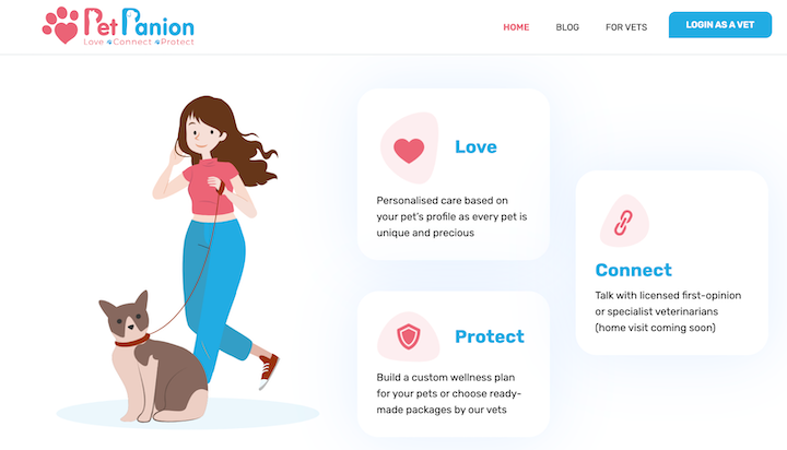
The emotional appeal is clear here—if you love your pet and want to protect them, PetPanion can help. By including testimonials from good, loving pet owners excited about this product, PetPanion could offer more targeted social proof. The custom illustrations are cute, but this is an example where user generated content and testimony from real users could be a game changer.
4. Personalize when possible
If you can target your startup landing page to your user’s location, you can make your offering more appealing and make the solution even better fit their needs.
Here’s a landing page for sMover, a platform that helps connect users with real estate agents in their area.

This design works well, and the copy is straightforward and effective. It could be more focused and more effective if it was location-specific. “Search for the best real estate agents in Boston,” for instance.
You could do this dynamically with dynamic personalized content or by creating specific market based pages for the top 50 markets you want to be in. Doing the latter would have added SEO benefits that could drive targeted organic traffic long term.
Either way, with that level of specificity, sMover could even test out showing a few preferred or top-performing agents as a secondary way into the funnel.
If there’s an opportunity to add personalization to your landing page, go for it.
5. Test your copy
We’ve already talked about how important your copy is. You need to pack as much information for your target customer in as few words as possible. The best way to make sure those words are working for you is to test your copy.
To run a simple A/B test, make sure to test one piece of copy at a time. You can test an emotional appeal versus a logical appeal in your hero copy, or you can test including your brand story or skipping straight to the features. Whatever it is, make sure it’s an isolated variant so that you can be sure any difference in CTR is attributable to the change.
By testing your copy, you can identify what works for your audience—and then keep optimizing your landing pages for even better performance based on that data.
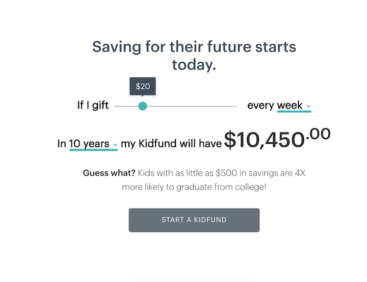
6. Include compelling interactive content
Interactive content is a great way to create an engaging landing page for your audience. It’s also a good way to let them visualize the value of your product or service.
Kidfund has a great interactive calculator that lets the user see how much of an impact a regular gift could have on a college fund.
Vint is a startup that helps users invest in wine. Its landing page is clean and gives me confidence. My biggest piece of feedback was tha it doesn't "show me the money".

I would probably test Adding a graph showing actual IRR/ROI for a great vintage so that users can quickly take action. A trend in investing is to give the users something. In this case, you could give also test "get $XX added to your investment account when you deposit $500"
7. Use video to explain your product
Visualizing your value is important, but visualizing your product is, too. Take this example from Patter.
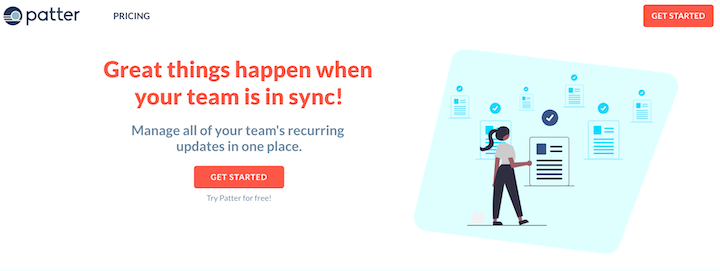
This is a cool platform that helps you check in with your team with templates and then aggregates those updates for review and distribution. Useful, right?
I loved what they were saying, but adding some video clips of the product or an explainer video would be really helpful in showing me the Wow factor and driving me to create an account.
8. Keep mobile in mind
Mobile traffic accounts for half of global internet traffic this year. That means you need to keep mobile in mind when you’re designing your landing page.
Make sure to test out scale, image overlays, and more to ensure that your page is optimized for mobile traffic. You don’t want to give up those conversions.
9. Ask for contact information
The goal of a landing page is to get your visitors to complete an action. But if your goal is to use the landing pages for lead capture, you need a way to contact your leads. You need to ask for contact information on your landing pages.
This might sound too basic, but it’s worth the reminder, especially for startups looking to drive app downloads. When you encourage this action on your landing page, you lose control of whether or not someone follows through with a download with the “Download” button directing right to the app store.
Instead, get a phone number and text the user a link to download your app. That’s what I suggested to bewifi, and here’s the updated landing page below.

Now, the “Start Now” brings users to a sign up page that prompts them to submit their email address. A phone number and an SMS could work well for an app download, too. You can text the link to download and then follow up with marketing messages.
I like this approach because it puts you in more control to nurture users who don't end up downloading the app. You can send a couple follow up nudges which should live your conversion rates.
10. Test your CTA
We’ve talked a lot about testing different elements of your page to determine which works best for your audience and for your business. This is a huge element that you need to test: your CTA.
Take this example from Govrn.
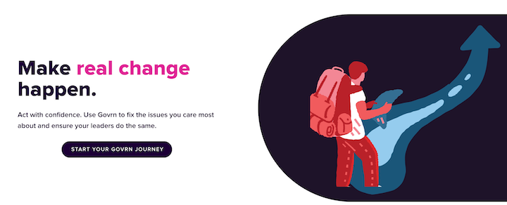
Starting your journey is appealing, especially with accompanying imagery, but it’s not the clearest call to action. What happens next? The user joins Govrn to see existing and, from there, has the opportunity to start their own fund. To figure out which CTA is best, it would be good to test with another option, like “Explore Causes” or “Start My Own Cause Now.”
Need some CTA inspo for your tests? We've got 107 Call to Action Examples You Can Steal Now!
Let data drive your startup landing pages
There are a lot of elements that can make your landing page successful, and here are the top ten tips for improving your startup landing pages:
- Appeal to emotion in your copy
- Prioritize the most important information
- Add social proof
- Personalize when possible
- Test your copy
- Include compelling interactive content
- Use video to explain your product
- Keep mobile in mind
- Ask for contact information
- Test your CTA
Now, don’t get discouraged by all the decisions that leaves you with. I talked about testing throughout this article, and that’s because it’s the best way to figure out what works best for your and your business.