
Do people like your landing pages? I'm not asking about your SERPs, bounce rates or conversions (although those can be useful proxy measures). I'm asking whether an ordinary person on the street would find your landing page accessible, useful and enjoyable.
Most people who work on landing page creation—from developers to designers, copywriters to CMOs—know that a landing page should be a hub full of keywords which drives customers towards a particular action. But few people can design a landing page that doesn't make consumers want to chew through their computer cables. Too many landing pages are confusing, boring or otherwise frustrating to read.

That’s why this article isn't about cool SEO tricks or the magic "right" number of words per landing page. Instead, I'm focusing on ways to make your landing pages appeal to ordinary consumers.
Here are seven ways to make your landing page more engaging for, you know, actual human beings.
1. Personalize—without getting creepy
This is a tricky line to walk. Modern web trackers and ad technology can give you a huge amount of information about someone as soon as they land on your website. The real question is, what do you use that data for?
Some types of personalization are helpful. For example, this website spotted that I was visiting from the UK, and that I hadn't been on the site before. That's great: Now all the prices are in the right currency, and I'm even being offered a discount.

However, if you want to target more specifically, you need to be tactful. Retargeting ads and product recommendations can be a very powerful way to boost conversions. But most people don't like to be reminded explicitly.
So you can throw up a sidebar with "products that might interest you." You can offer a download that's relevant to the user's previous searches on your website. But you should really avoid phrases like:
- We noticed you looking at
- Yesterday, you clicked on
- Looks like you're in search of
While we totally have the technology to see exactly where each user clicks on your website, most people are very uncomfortable with that idea. The usefulness of personalization is outweighed by the chill running down their spine.
Similarly, when you ask website visitors for information, don't get too personal too fast. Here's an example you'll recognize if you work in marketing: a free ebook in exchange for contact details.

Except this form isn't just asking for contact details. It's also asking for job title, company details, and even estimated revenue. A lot of people will bounce off this form because it feels intrusive. If you want that level of detail, you either need to build a relationship first—or offer a lot more value upfront.
2. Offer multiple ways to interact
When someone reaches your landing page for the first time, it's only the start of your relationship with them. While you might have some background data about them (as discussed above), you don't know much about what content they prefer, what exactly they're looking for, and how they'll choose to contact you.
One of the fastest ways to engage attention and learn more about landing page visitors is through interactive content. Interactive content can be as simple or as complex as you choose to make it.
You could use:
- Instant chat buttons to contact your support or sales team.
- A "flowchart" structure, where viewers select which version of the landing page they want to see (for example, aimed at marketers or C-suite; video or text).
- A choice of introductory videos.
- A quiz that makes personalized product or service recommendations.
The goal is to immediately offer added value and entertainment, while collecting data that will help you sell better.
Whatever kinds of content you choose, the key is to give people options. Some people love watching videos; others find text easier to process or access.
You should also try to keep the interactive element relatively simple. You want to give people a feeling of control, personalization and engagement—without overloading them. Try to hit the sweet spot between easy access and a novel experience.
Want some interactive content inspiration? Check out these expert-approved examples.
3. Remove the jargon, leave the keywords
Out of all the ideas in this article, I recognize that this one is probably the hardest sell. We marketers love our insider-speak and buzzwords. Once you've been in the industry for a while, you probably don't even notice yourself using jargon. Or if you do, you reassure yourself that you're just making sure you hit all the keywords.
But let's be real. No sane or normal customer has ever searched for "solutions," "inbound systems," or a "strategic staircase."
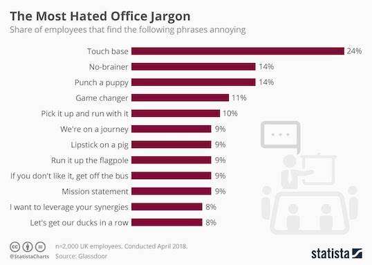
It is really hard to spot your own jargon. Even individual businesses build up their own ways of speaking and referring to products. This is useful for team meetings, but totally bewildering for customers.
Start by creating a list of terms to avoid in your copy, and if you still can't filter out the jargon, get someone from outside the company to take a look. And remember: Unless you're selling chemistry sets, you should never, ever use the word "solutions."
4. Be transparent
I spend a lot of time telling people to simplify their landing pages. Fewer pop-ups. Fewer CTAs. Less jargon. Less overt personalization.
But there's one aspect where you probably need to add something. How's your privacy policy doing?
Landing pages that ignore privacy laws or don't offer contact details are really off-putting for customers. So before anything else, you should make sure that you have an active privacy policy and adjustable cookie settings on all your landing pages. This is especially important if you want to reach customers in the EU (and, increasingly, everywhere else). I've seen too many websites where the cookie settings are frozen, hopelessly complicated, or lead to an endless loop of irrelevant pages. Consumers hate this, and so do privacy regulators.
You should also have actionable, up-to-date contact details. Again, this is a basic part of building trust. If consumers can't figure out where you're based or how to contact you, then they won't feel confident doing business with you. Whether it's a contact email address or a contact form, there should be some way for people to speak to you directly.

5. Prioritize accessibility
Let's talk about accessibility—because we don't talk about it enough. An estimated 1 in 5 people has some form of disability, so if you're not building accessibility into your landing pages, then you're ignoring up to 20% of your potential customers.
It's not hard to get the basics right:
- Create a proper hierarchy of headings and body text, so that screenreaders can understand your landing page.
- Add alt text to all images (especially if they include text, because screenreaders can't see text in images).
- Add subtitles to all videos.
- Add transcripts to all podcasts.
- Use fonts and color palettes which maximize visibility.
I love fun landing page designs, but you should never sacrifice simple navigation, load speeds, or accessibility for the sake of doing something cool.
Let's take a look at an example. Earlier on, I mentioned product recommenders, and this is an example of a landing page that combines interaction with a personalized experience.

Looks great, right? It's a colorful, modern design. The header and CTA button are visible to screenreaders, so full marks there.
But something's not quite right. I ran a quick color palette analysis of the landing page, using Image Color Picker and Who Can Use. (Bookmark those; they're amazingly useful!)
And here's what I got:

That combination of pink and white is difficult for pretty much anyone with color blindness (about 1 in 12 men) or a visual impairment to see. It's difficult to engage someone with your landing page if they can't see what's on it.
Running that color palette test took me less than two minutes. If you want to get a rough idea of where your landing page is at, most browsers now have built in text-to-speech tools. Start it playing, close your eyes, and see how far you can get. If you want more detailed tips on accessibility, try WebAIM's excellent resources or look into working with an accessibility expert.
6. Limit your CTAs
If you're seeing a lot of landing page visitors, but comparatively few conversions, then you may simply be asking too much of people. I see a lot of landing pages which have stacked up several different CTAs. They're bursting with information, but they leave web visitors a bit confused.
To prove my point, I decided to compare a couple of email marketing services, or EMSs. One EMS I checked out had a single CTA on their homepage.

Lovely. Then I hopped on over to another EMS and, well ... I was overwhelmed.

That's seven CTA buttons from a single landing page. In other words, that is way too many CTA buttons.
As an absolute maximum, I would have two CTAs on a single landing page. If I only have one CTA, I might repeat it throughout the page. But I wouldn't offer people seven different options, and then expect them to make a decision quickly.
While we're at it, let's talk about pop-ups. Pop-ups are still an effective way to market. But you need to keep them under control. I have two unbreakable rules for pop-ups:
- No more than one pop-up per page.
- No visitor should ever see the same pop-up twice.
And if I still haven't convinced you, here's your homework for this article: Go to the independent newspaper website and count how many pop-ups and video windows you have to close before you can read an article all the way through. Then take your blood pressure.
7. Test on real users
Throughout this article, I've been trying to look at landing pages through the eyes of ordinary consumers. Most people don't care about the marketing theory behind pop-ups, personalization and multiple CTAs. All they know is, most websites give them a miserable experience.
Which brings us to my last and most important tip: Test your landing pages on real people. They'll see things you won't, like typos and jargon. They also won't discount the things that you discount.
What do I mean by that?
Here's a rough transcript of a conversation I recently had with a web designer:
"Ignore the loading icon, that shouldn't normally be a problem. You can just close that cookie notice because it's not really part of the landing page. Oh, you're seeing that pop-up because of the last page we viewed, just ignore that. Don't look at the sidebar, that wouldn't come up if you had an ad blocker on. Now just scroll that past that block, we're planning to update that…"
Yeah. Trust me, your website visitors will not be that forgiving. You need an objective pair of eyes that will notice and, inevitably, get annoyed by every tiny flaw.
Create engaging landing pages for better results
Let's review those seven ways to improve your landing pages:
- Personalize without getting creepy
- Offer multiple ways to interact
- Remove the jargon, leave the keywords
- Be transparent
- Prioritize accessibility
- Limit your CTAs
- Test on real users
That sounds like a lot to keep in mind, and it is. But if you follow these tips, your landing page will be smart, effective, and pleasant to use. Now go out there and create seriously engaging landing pages!
About the author
Corinna Keefe is an editor at Assignyourwriter.co.uk and freelance writer who specializes in digital marketing, martech and engagement. She has lived and worked in ten different countries, but is currently based in the UK. Her clients include Easypromos. Connect with Corinna on Twitter or LinkedIn.