
I’m excited to share that we recently released 43 new components. Here at Unstack, we’re focused on equipping founders and marketing teams with the no-code tools they need to launch and scale their business in an easy-to-use platform. Our library of components allow users to build even better pages—with engaging dimensional design, stacked elements, scrolling carousels and more.
Here, I want to share how we used these components to redesign our own homepage, plus how you can get started using these for your own website.
But first, let me give you an overview of the components available.
What are these components?
Our components are ready-to-use elements to further customize your brand’s website. These are no-code sections that you can add to personalize your site, improve your web design, and level up your branding.
Unstack’s no-code website builder already lets you create a great looking website that gets results quickly. With these components, now you can do even more without code. Here are some of the components I think will make the biggest difference:
- 3D icons, media, and images
- Isometric layouts for icons, images, and
- Blog features to highlight your content on other pages
- Side-by-side media, text boxes, icons, and more
Now, I want to share how we used some of these to launch our redesigned homepage.
How we used these components to upgrade our homepage
I’m always looking for a way to improve our homepage. Most of the time, I’m running A/B tests for small copy tweaks or testing our personalizations. With new components, I knew we could make a huge upgrade. I’m pretty excited about what we pulled off.
The biggest change you’ll see right away is an animation at the front and center of our new homepage.

Our new designer Austin built this awesome graphic, with a text conversation and an animation of our Unstack platform in action. We created this as a custom component—I’ll share more about those next.
We used the new App/Media with Quote component for a few sections on our new homepage where we highlight what the Unstack platform offers. With this new component, we’re able to feature an engaging image, copy explaining the product feature, a CTA, and a customer quote complete with a picture. That’s images, engaging copy, and social proof all in one nicely packaged component. Take a look:

In the screenshot, you can also see our new background—lighter and brighter.
To showcase our integrations, we used the new Isometric component. This has a text box on the left and a grid of six icons or images on the right. I thought this would be a perfect way to feature some of the integrations our users connect most, and I can see it being used in so many other ways for other brands.
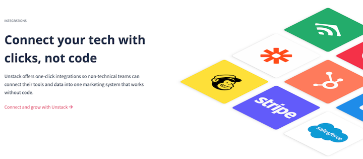
The best part of this component is that it’s interactive. Each time you hover over a square in the grid, it moves. You can test out the interaction, and see the rest of the redesign, on our homepage now.
How to use these components for your website
Our entire component library is available now to all users on our Full+ plan, and they’re good to use to create awesome landing pages or web pages. (If you’re not currently a Full+ customer, you can contact us to upgrade.)
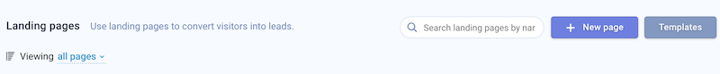
After you log into your account, choose whether you want to create a landing page or web page. For a landing page, click “New Page” to get started.
Once you’re in the page editor, you’ll see a button that says “Add Component” at the bottom of the screen.
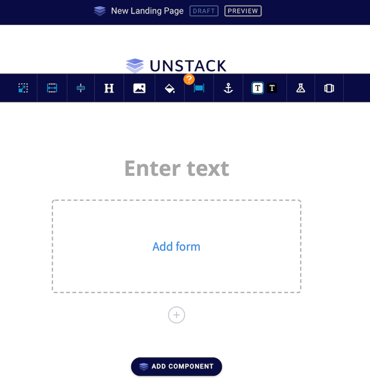
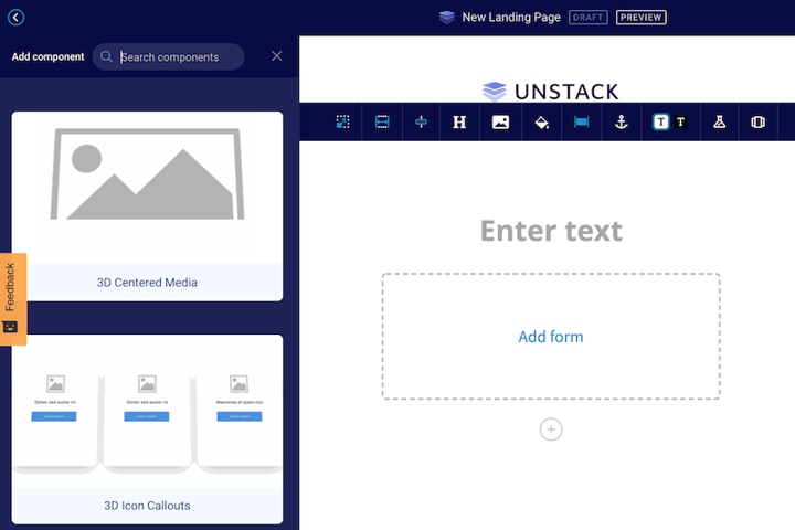
Clicking on that button will open a sidebar where you can search the component library and find one that works for your design.
If you need a new page for your website, on the other hand, you can click “New Page” there.

Then, it’ll bring you right to the full component library, where you can scroll through the options or search for what you’re looking for.
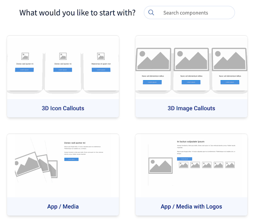
Remember, these are just a few of the components available now.
When you find one that works for your page, just click on it to drop it into the page editor and start adding your media and content.
How to create your own custom components
I’m excited about the 43 components that are ready-to-use in so many accounts today. But if you’re looking for something that we haven’t added in there—or you want to further customize one of these components—you can create your own, too.
In your Unstack account, and you have a Full+ plan, you’ll see “Component Editor” in your left navigation, now.
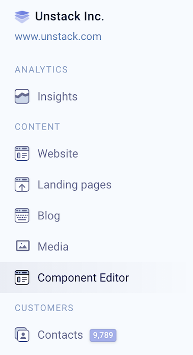
There, you can code your own custom components right in the Unstack editor. Once you’ve saved, you can use these across your website and landing pages.
Ready to get started?
I can’t wait to see what you build with these new components. If you want to, share in our Slack community, where users regularly swap advice on building with Unstack.
Want to try out Unstack? Start building today.