
Creating a landing page is an indispensable way of optimizing your website to drive traffic and increase conversions. The catch? You need to create an effective, well-designed landing page to get that performance.
That's not always easy. After all, creating landing pages is one of the top five challenges that every marketer faces. But it doesn't have to be a headache. In this article, we'll walk through the process on how to create a landing pages that deliver for your business. We'll cover:
- What a landing page is
- How a landing page can help your business
- What makes a great landing page
- How to create a landing page that converts
Let's get started.
What is a landing page?
A landing page is a webpage created mainly to help with marketing campaigns. Here's an example:
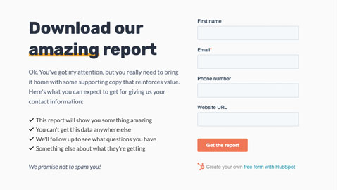
Because the landing page is designed to encourage your visitors to take action, it features a call to action, or CTA. This is essential in building a conversion path that turns visitors into customers.
But what are those actions? And how can landing pages help your business? Here are five ways that creating landing pages can help you meet your marketing and business goals.
1. Capture leads
Marketers can capture leads much faster if they send visitors to a dedicated landing page instead of the homepage. So if you want an effective approach for reeling people in, creating a landing page is the answer.
2. Collect information and demographics
The trick is to create a landing page with a form to gather contact information and demographics of your visitors. And once you have the details you need, you can study your visitors and segment them effectively.
3. Get rid of distractions
Sending visitors to your landing page clarifies what specific action you want them to perform on your site. But you couldn’t say the same if you send them to your homepage, with distractions like site authors or site navigation.
4. Encourage visitors to take action
Many people are indecisive and if you don’t help them make a decision, they’re not about to do it. So let your landing page’s CTA give them the push they need to make up their minds.
5. Allow for monitoring and improving performance
It lets you take your site’s performance to another level. Remember, you can conduct A/B testing and create variations of landing page elements to determine which converts the best.
What makes a great landing page?
After getting hold of the importance of landing pages, it’s understandable why you can’t wait to get one up and running. Well, that’s good. However, you should know that building a landing page is one thing. And building a landing page that actually converts is another.
So if you want a landing page that works, try to using one or more of these eight key elements.
1. Irresistible headline
“The easy, affordable 401(k) for small businesses.”

That’s the headline of a 401(k) provider for small businesses. It’s great because it conveys the message clearly. When visitors come across this statement, chances are, they won’t mistake its message for something else.
It says it right off the bat and leaves no room for confusion: Easy and affordable 401(k) for small businesses. So if you’re running a small business who’s after a 401(k) that’s easy and affordable, it’s where you can get it.
This example, by the way, is from Guideline. It’s a company that provides retirement plans for advisors and accountants.
So if you want to create a great landing page, why not gear it up with a headline as good as that? Be sure to craft your headline by clearly stating your product or service.
2. Supporting subheads
Your headline may be irresistible. But building a landing page that converts means adding subheads, too. They’ll support your headline and make it more effective.
With a headline that’s short and concise, you’re heading in the right direction. Sadly, though, its briefness could work both ways. While it can make things clear, you can also say the same about how it can make things vague for your readers.
That’s why something that complements your headline should come to the rescue. Simply put, you also need to include additional information to explain what you’re getting at. And to do that, you should use subheads.
Let’s turn to Slack for winning examples of how subheads make headlines reach higher ground. Practically everywhere you look at its homepage, you’ll see headlines. And these headlines are all backed by a subhead that provides relevant information.
Check out this one: “Messaging that brings your team together.”

And this statement is backed by a short explanation of how messaging can bring teams together. So do you notice how clearer and more powerful it is after reading the subhead? Remember that when you're creating your landing pages.
3. Direct and easy-to-read text
Let’s be realistic. You wouldn’t get on a bus that doesn’t say where it’s headed, right? For all you know, he’s just about to drive you in circles and get you nowhere.
Well, that’s also how it is with your website. Your visitors don’t want you to drive them in circles. If they’re having trouble understanding your landing page’s content, they’re less likely to perform an action.
Instead, make your visitors feel confident about what they can do on your site. And the way to do that is to present them with nothing but direct and easy-to-read text.
An example is H.Bloom. Its landing page offers a sign-up form that’s just like any other sign-up form.

The catch is that it details what will happen if you use that sign-up form. Now, not a lot of companies do that. And other than providing details for its sign-up form, you’ll find information on how its operations work, too.

4. Indisputable Solution to Customer Problem
Did you know humans are wired to stay away from pain?
So if you want to create a great landing page, be sure to acknowledge your visitors’ pain points. Assure them that you can hear what they’re saying and you can help avoid that pain.
The psychology behind it is simple. If you can make your visitors think about their pain, they’ll also be looking at you to help them find relief from that pain.
Muzzle gets this. It’s a Mac app that silences notifications.
Its landing page is a marvel because it offers an easy answer to a customer’s problem. And the evidence you need can be yours just by visiting its website.
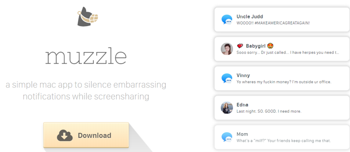
In the upper right area, you’ll be welcomed by an animation that perfectly shows how distracting notifications can be. And to its left, you’ll find the solution to this problem: Download the product.
5. Compelling visual content
When you're creating a landing page, you're setting up a webpage that visitors will see first. They'll read it after, yes, but the visual is key. That's why you want to make sure it's compelling. And custom illustrations are a great way to go.
Teambit features an illustration-heavy landing page. And it’s an impressive example of using compelling visual content!
Its short and sweet message gives way to an office of lovable animals that are all pleased with Teambit’s operations. The above-the-fold section comes with a simple sign-up form. And below are statements about Teambit that make it stand out from traditional people processes.

So if you want to create a landing page that also stands out, the technique is to follow Teambit’s lead. After all, not every person out there likes to stay on a site without any amusement to offer.
This works wonders even for social media networks. For one, Facebook posts with images get 104% more comments.
Compared to text alone, adding visually-appealing elements to your landing page is more effective. It makes you likable and worth paying attention to. And more than stealing attention, images can entertain your visitors.
6. Click-worthy CTA
The main purpose of landing pages is to encourage visitors to take action. And this purpose should be unmistakable to them.
Want them to subscribe to your email list? Click a link? Buy a product? It’s up to you, really! Regardless of the specific action you want them to take, your landing page should have a CTA that helps them clearly understand what you want them to do.
A fine example is the landing page of Nauto, a platform for self-driving cars. You see, the landing page caters to companies who oversee fleets of self-driving cars and make these companies feel safe about self-driving cars. And its CTA is all about asking people to take home this ebook with useful safety information.
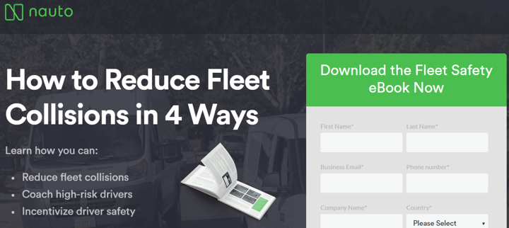
A visit to this landing page will make you see why its campaign is a success. It had two well-designed buttons that asked visitors to download the ebook. Plus, it filled its landing page with relevant facts and statistics.
Need some great CTA inspo? Here are 107 Call to Actions Examples You Can Steal Now!
7. Clear content sections
Remember, your landing page should always offer clarity and not confusion. You should be straightforward when giving statements, keep your language concise, and make sure your content is clearly separated.
So how do you create a landing page with clearly separated content? By providing visual separation when you present them!
That’s another ingredient of a great landing page. It’s about clearly separating content sections. This way, users won’t feel overwhelmed during their stay.
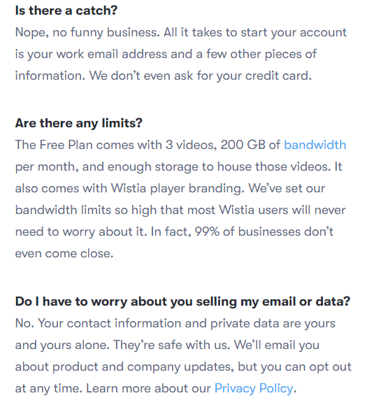
Wistia, a company that supports brands with its creative content, is worth looking up to in this department. Its landing page couldn’t be clearer in its message: It wants to accommodate visitors who want to create an account. That’s why its sign-up form is etched on the upper section. And if you scroll down, you’ll find a section with answers to FAQs.

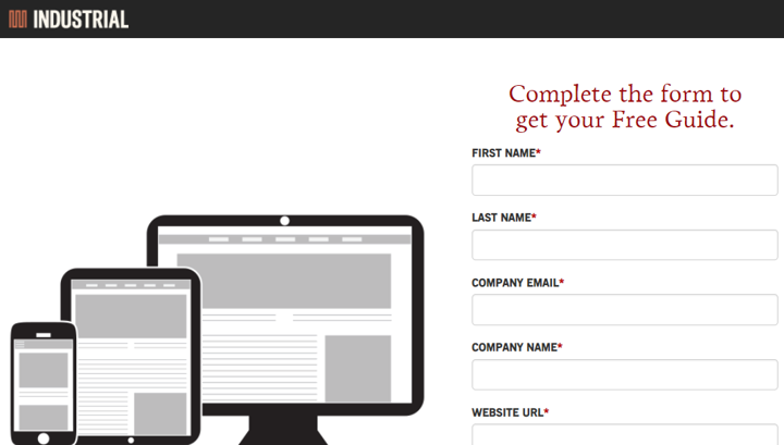
8. Great use of colors
The choices of colors you use for your landing page are totally up to you. The matter is subjective so feel free to choose the ones you like. But it's best not stray too far from industry standards. You want to standout, but you still want to have a great-looking page.
So let’s look at how Industrial Strength Marketing pulls off a win with colors.
If you head to its website, you’ll see that it used a combination of black, red, and white to emphasize its main points. This set not only makes text readable. It also shows urgency and fierceness.
How to create a landing page using Unstack
With Unstack, you create a great landing landing page from scratch quickly and easily. All you need is to sign up for a free account. And after you log in to your account, you can get started.
Here’s a walkthrough of the process:
First, select "Landing pages" on the left side of the dashboard.

Next, create a page by clicking the plus sign. Then, choose between a blank page and some templates.
Because you’ll be whipping up a page from scratch, load a blank page. If you want to use some templates, you can go with that option, too.

From there, you’ll be directed to a page builder where you can get the ball rolling on your page. You can add a logo, texts, and a form.
If you hover your mouse on the top, a toolbar will drop down. This way, you can have more options for customizing the sections of your landing page.

And once you’re done, just click "Publish page."
Before you publish your page, don’t forget to specify a title, URL, and short description. You can do this under the page settings window, which will appear once you click the "Publish page" button.

Start creating killer landing pages today!
Remember not to let the task of creating landing pages stress you out. Sure, you need it to drive traffic to your website and help you raise conversions. So naturally, you can only make this happen if you create a great landing page. And as mentioned above, there is no single fix for this because of the many factors that come into play.
If you look at things only from that angle, it’s understandable that you find it overwhelming. But back away for a second. And think of how it can also be made simple with readily available page builders and other tools.
So don’t worry too much about it. You just have to gear up!
To start creating a landing page that converts, one tool you can use is Unstack. It integrates with Facebook, Twitter, and more. You can sign up for free today!